Conversion optimisation finds where visitors drop out and redesigns those moments. The usual causes, the fixes that work, and how Studio Yapa runs it.
Conversion optimisation is the practice of finding the exact moments where visitors give up and redesigning those moments so more of them continue. It is not a bag of tricks. On most sites the number moves when three things improve: clarity of the offer, friction in the path, and trust at the moment of commitment. At Studio Yapa, a product design studio in London, we treat conversion work as design work, because that is what it is.
Traffic is expensive. Making the traffic you already have convert is almost always cheaper than buying more of it.
Why do visitors actually leave?
Across the sites we audit, the causes repeat with remarkable consistency:
- The page answers the wrong question. Visitors ask what is this and is it for me. The hero answers how innovative the company feels.
- The path has too many decisions. Every extra field, option and step gives someone a reason to finish later, and later never comes.
- Commitment arrives before confidence. The form asks for a card before the page has earned belief.
- Speed and polish leak trust. Slow loads and misaligned screens read as risk, especially near payment.
Visitors rarely leave because they decided no. They leave because deciding yes was made too hard.
How does design move conversion?
The reliable wins are design decisions, not copy hacks:
- One job per page. Each page gets a single primary action, and everything on the page argues for it.
- Concrete language. Buttons that say what happens next outperform buttons that say get started.
- Fewer, better form fields. Ask only for what the next step genuinely needs. Every removed field is a raise.
- Proof near the ask. Testimonials, numbers and guarantees placed at the moment of hesitation, not in a distant section.
- Fast, stable pages. Performance is a conversion feature. Users decide in the first seconds whether a site feels safe.
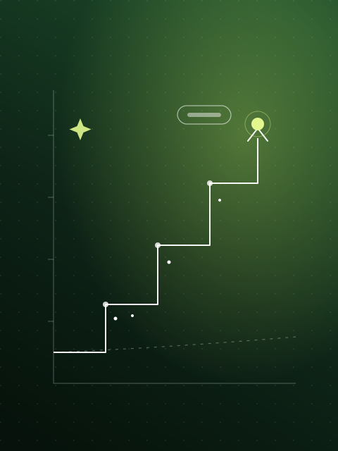 The number moves in steps, not leaps.
How Studio Yapa runs conversion work
We agree the metric before the work starts, then we measure it. Every engagement follows the same loop:
- Find the moment. Funnel analytics, session recordings and heatmaps show exactly where people give up.
- Understand why. A senior designer walks the path the way a first time visitor does, and tests the hypotheses with real users.
- Redesign the moment. Layout, words and flow are designed together, because separating them is how pages end up beautiful and vague.
- Measure against the baseline. A/B tests where traffic allows, and session recordings and funnel analytics where it does not. Either way the result is checked, not assumed.
For Gala Music, mainstream listeners were arriving curious and leaving in minutes, because every screen led with token prices and scarcity counters. We rebuilt the experience around the way people already discover music on Spotify, YouTube Music and Apple Music, so fans browse the way they always have and meet ownership on their own terms. The redesign spanned thirteen content types in two months.
For Smart Energy GB, the brief was to improve click outs to energy suppliers. An audit found the core issues, and the redesign was proven through eighty user tests across desktop and mobile, old site against new.
Common questions
How is this different from a UX audit? An audit maps all usability problems. Conversion work aims at one number and pulls every lever that affects it. They often run together.
How fast do results show up? Quick wins can move the number within weeks. Structural changes to flows and pages typically show within one to two months of shipping.
How much does conversion optimisation cost? Each engagement is quoted to its scope. A focused fix to one funnel suits a fixed price project; ongoing optimisation suits a retainer with a set number of design days each month.
Do you rewrite copy too? Yes. On conversion work, words and layout are one discipline. Separating them is how pages end up beautiful and vague.
Who does the work? A dedicated senior team focused on your product alone, with direct design time and no handoffs to juniors.
Conversion is where design pays for itself fastest. If your traffic is fine but your signups are not, book a discovery call with Studio Yapa and we will show you where the number is leaking.